
|
|
|
A blog by Ron Beavis that focuses on basic concepts in proteomics data analysis. The entries
are supposed to provide some insight into topics of current interest in the field as well as some historical
context for new developments.
Proteomics basics 101 #6, by Ron Beavis (2015/05/20)
Monte Carlo methods for evaluating LC/MS/MS data sets: II. Peptides & derviatives 
In the previous blog (see #5 below), the use of Monte Carlo simulations to understand the relationship between the
number of spectra taken and the number of unique proteins identified was introduced. In this entry, the same
type of analysis will be applied to the peptides, once again trying to give a clearer idea of how the number of spectra
taken is related to the number of unique peptides identified.
Monte Carlo simulations for this type of analysis are performed in the same way as they were for proteins. A given
set of results containing N peptide identifications is used and smaller subsets of the spectra (containing S identifications) are
created by random selection from the full set, without replacement. By varying the size of S, the relationship between
representing the number of unique peptides and the number of spectra taken can be generated. In practice, the protein and peptide
simulations are easily performed simultaneously, as the subsets can be examined for both unique proteins and peptides. The peptide
simulations converge quite quickly in most cases: no more than 5 are usually required to generate a stable average. As always
with simulations, exercise caution and always thoroughly investigate the simulation's stability whenever using this method
to make decisions. In the figures below, each line represents the results of averaging 5 simulation runs.
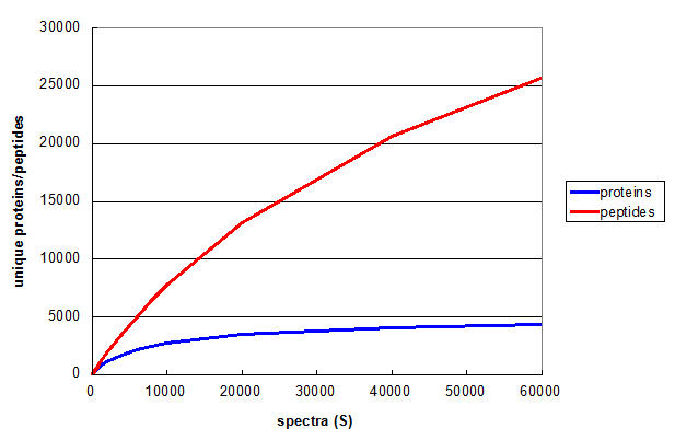 Figure 1. A Monte Carlo simulation of the effect of changing number of spectra taken in a 1D LC/MS/MS experiment. From Deeb SJ, et al., GPM11210037710.
Figure 1 illustrates relationship between S and the number of unique peptides (red) and proteins (blue)
for a straightforward shotgun proteomics analysis. Both curves start off with the same slope, but the rate of increase of the blue protein
curve falls off much more rapidly, clearly approaching an asymptotic value. The red peptide curve maintains a significant rate of increase
across all values of S, indicating that further measurements would be required to measure all of the unique peptides
accessible to this type of experiment, even though few new proteins will be discovered.
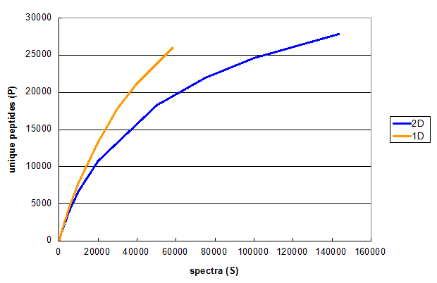 Figure 2. Monte Carlo simulations comparing peptide identifications in 1D and 2D LC/MS/MS experiments using the same cell line. From Deeb SJ, et al., 1D (orange) and 2D (blue).
Figure 2 illustrates the results of a typical experiment attempting to increase the number of spectra taken, using a multidimensional
chromatography approach. The orange line is the same as the red line in Figure 1, while the blue line represents Monte Carlo
simulations performed on the results of a 2D run on the same sample, using 6 SAX fractions as the first dimension. These
simulations show that even though the 2D experiment results in more unique peptides, the 2D method really requires twice as many spectra
to get to the same number of unique peptides as the 1D method generated. Therefore, if the goal of the experiment was to find more
unique peptides, then extending the 1D method to a longer gradient or increasing the MS/MS sampling rate would be more efficient
than using the 2D approach.
Closer examination of these results generates a simple explanation for this effect. In the SAX 2D experiment, many of the same peptides
are found in adjacent fractions. This method is therefore less effective
at finding new peptides than the number of overall spectra would suggest, as the mass spectrometer is kept busy identifying the
same peptides repeatedly rather than sampling new sequences. This situation has some benefits for quantitative experiments, where
multiple observations of the same peptide can be used to determine statistical confidence and identify outliers.
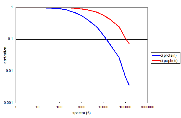 Figure 3. The derivatives of protein and peptide Monte Carlo simulations for the 2D data used in Figure 2, displayed as a log-log plot.
Figure 3 demonstrates the utility of derivatives in quantifying the results of this type of simulation. The first derivative of the
protein simulation (blue) and the peptide simulation (red) both remain nearly 1 for the first two decades of S. This means that every
additional spectrum added to the measurment resulted in a new peptide or protein. By the third decade of S the derivative functions
had diverged considerably.
One way to think about the practical consequences of the derivative functions is to use them to predict the consequences of
adding additional spectra to the measurement. For instance, if you were to add 1000 additional spectra to the full experiment, it
would result in finding about 4 new proteins and about 74 new peptides. You can also extrapolate the red curve and predict that if you wanted to get to
having only 10 new peptides per new 1000 spectra, it would require a data set of about 1 million spectra.
Proteomics basics 101 #5, by Ron Beavis (2015/05/05)
Monte Carlo methods for evaluating LC/MS/MS data sets: I. Protein ids
A common problem in practical proteomics data analysis is the characterization of data from a particular experiment
using some set of parameters that indicate how well the experiment was performed. For example, the number of unique proteins
identified, the number of unique peptides identified and the total number of spectra assigned to peptide sequences are
frequently reported. These parameters can be used to compare results within a set of similar experiments, but they are
limited in their utility when comparing different experimental protocols, particularly when they are performed in multiple
laboratories (or even by multiple individuals in the same lab). These parameters also have limited use as diagnostics, as they
cannot be easily used to determine if a particular experiment has thoroughly explored the peptides and proteins present in
a sample. Questions like "What if more (or fewer) spectra had been taken?" or
"What if only one fraction was used, rather than four?" cannot be answered directly by this type of parameterization
and the parameter values themselves give the analyst very little guidance for planning future experiments.
The reason that this type of parameterization is used, apart from tradition, is the lack of mathematical models for
characterizing the multi-step, multi-instrument process that results in a list of identified proteins. Identifying all
of the sources of systematic differences and random fluctuations present in the system and measuring them would
be so complex as to be prohibitive (and perhaps not even possible). Similar problems in experimental nuclear physics
led to the development of a way of answering "What if?" type questions, that are commonly referred to as
Monte Carlo methods. The general idea is that
if you have a large data set that was expensive to acquire, it may be possible to determine a lot about the data acquisition
process by breaking the data into smaller subsets generated by the random selection of individual data points. Varying the size of these
subsets can reveal useful trends that are not apparent from any gross parameterization.
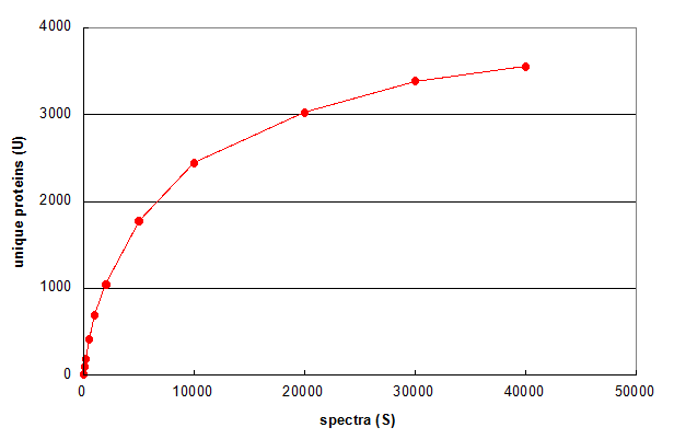 Figure 1. Average of 5 Monte Carlo simulations showing the effect of changing the number of spectra in a 1D LC/MS/MS experiment. From Deeb SJ, et al., GPM11210037710.
Figure 1 illustrates a simple use of Monte Carlo methods to characterize an LC/MS/MS experiment. First, the data set
was reduced to a list of all of the spectrum scan numbers and identified proteins (one protein per spectrum), resulting in a set
of N spectrum-id pairs. Then simulations were performed by
selecting a smaller subset of those spectrum-id pairs (S) at random from the larger set and determining how many unique proteins were
identified in each of the subsets (U). For example, for a subset size of S = 10, 10 spectrum-id pairs were selected using a random number
generator that produced integer values between 1 and N, without replacement.
Figure 1 answers the question "What if only S spectra (rather than N) were taken in the experiment?" More than
half of the proteins would have been identified by taking only 5,000 spectra across the chromatogram. The other half required 35,000 additional spectra.
The graph also predicts that taking an additional 15,000 spectra would result in no more than 200 additional protein ids (~5%). This
simulation suggests that this experiment is approaching an assymptotic value for the number of protein ids — a value that is hopefully
representative of the total number of proteins present within the LOD of the experiment.
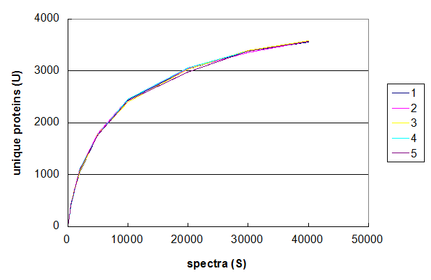 Figure 2. Five Monte Carlo simulations of the effect of changing number of spectra taken in a 1D LC/MS/MS experiment. From Deeb SJ, et al., GPM11210037710.
Figure 2 uses the same data set to demonstrate the range of values that can be generated using this
particular Monte Carlo simulation. The data was simulated five times using the same values of S and the
results of each simulation plotted in a different colour. The resulting graph shows that the results of these simulations are all
very similar and that the method results in relatively stable curves. For the purposes of understanding protein identification rates,
an average of 5–10 simulations should be sufficiently stable to extract quantitative predictions. It should be noted that
performing this type of analysis of a Monte Carlo method's convergence should always be performed before using the results
of the simulation to draw any conclusions.
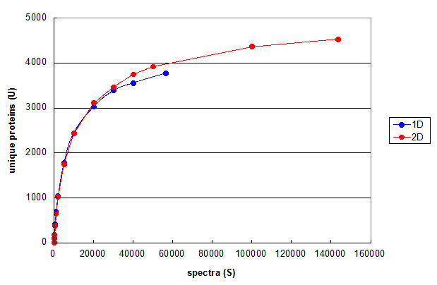 Figure 3. Monte Carlo simulations comparing 1D and 2D LC/MS/MS experiments using the same cell line. From Deeb SJ, et al., 1D (blue) and 2D (red). Each line represents the average of five independent simulation runs.
Figure 3 uses this type of Monte Carlo simulation to compare the results of optimized 1D and 2D chromatography experiments performed on the same cell line
(please see the manuscript for details).
These curves suggest that the main reason for finding more protein ids in the 2D run compared to the 1D run was
simply the result of taking more spectra. At comparable values for S, the 2D run is generating less than 10% more protein ids.
This analysis suggests that if the goal of the experiment is simply generating protein ids, then
the additional complexity and instrument time of using this particular 2D method is only generating a marginal
improvement in the LODs for the proteins in this sample.
Proteomics, however, is not simply about getting the maximum number of protein ids possible. In the next blog
in this series (Part II. Peptide ids) I will explore the use of Monte Carlo simulations to understand how
peptide ids are affected by changes in experimental methods.
Search engine basics 101 #4, by Ron Beavis (2014/09/25)
Chromatographic influences on peptide identification rate calculations.
It is very common to analyze the set of spectra generated by an HPLC MS/MS experiment as a group, thereby obtaining
an ordered set of peptide-to-spectrum matches (PSMs). The matches are then examined and statistical QA/QC measures applied, resulting
in a reduced set of PSMs assumed to be true positive assignments. The efficiency of this process is often
characterized by calculating the ratio of the number of true postive PSMs to the total number of MS/MS spectra acquired.
This ratio (R) is also frequently used to characterize the performance of one identification algorithm versus others.
The commonly used interpretation of R holds that the higher its value, the better the algorithm. In order for this to
be a useful idea, several conditions must be met by the data set:
These conditions are rarely, if every, met by any real data set because of the dynamic nature of HPLC
elution and the practical issues associated with timing sample injections & gradient changes with the
beginning and ending of the mass spectrometer data acquistion process. A more practical measure is calculated
by breaking the set of spectra into sequential bins, each containing an equal number of spectra, and then determining the
ratio of true positives to the spectra per bin, r. When plotted as a histogram, r can reveal quite a bit
about the actual experimental conditions and how well an HPLC MS/MS run was designed and programmed.
In each of the examples below, the data sets were divided up into 100 bins
for the calculation of r. The x-axis "scan number" corresponds to the
bin number (i) times the spectra-per-bin (n).
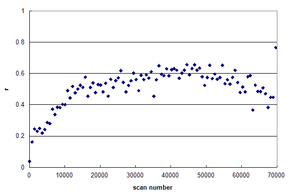 Figure 1, Data set #1. An r-histogram of an HPLC MS/MS experiment nearly meeting the requirements of Condition 1. From Oroshi M, et al., GPM32010008590. Figure 1 represents a data set, in which r is nearly constant across the entire
chromatogram. In general, the reversed-phase, gradient HPLC used in proteomics will result in peptides that
trend from hydrophilic, smaller peptides in the beginning of the run to hydrophobic, larger peptides at the
end of the run. Inspection of Figure 1 shows that r increases from scan 1 to 15000, but then remains quite
constant at ~0.60 until very near the end of the run. This type of r-histogram profile is to be desired:
it means that the HPLC run has been well designed and the MS/MS scans are being triggered productively
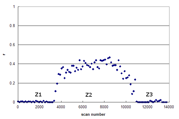 Figure 2, Data set #2. The r-histogram of a more typical HPLC MS/MS experiment. From Groessl M, et al., GPM11210030052.
Data set #2 is more representative of a typical HPLC MS/MS run. This r-histogram
reveals three distinct zones in the data:
While their extent may vary,
these three zones are very common in real proteomics experiments. Z1 represents the time delay
between the start of an injection (when the MS/MS acquisition is started) and when the first peptides
begin to elute into the ion source. This delay is caused by the time it takes for the sample loading isocratic
hold to finish and how long it takes for the gradient solvent front to traverse the plumbing from the
mixer to the end of the analytical column. Z2 contains the main body of the gradient analysis, with peptides
being eluted into the ion source. Z3 represents the end of the chromatogram, where the maximum value
of the gradient has been reached and the solvent conditions are held constant for an extended period of time. In
many cases Z3 will include an equilibration gradient, where the solvent is returned to
the same composition as the start of the gradient, in preparation for the next injection.
From the viewpoint of peptide identification, there is no real value to either Z1 or Z3; the data in Z2
represent almost all of the available peptide spectra. However, it is practically difficult to arrange
the timing of the start and end of MS/MS data acquisition to correspond to only Z2, so the other
two zones are usually present to some extent. It should be noted that the mass spectrometer triggers
MS/MS scans in Z1 & Z3 just about as often as in Z2, so it should never be assumed that
the existence of an MS/MS spectrum is correlated with the presence of peptides at the electrospray ion
source.
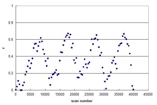 Figure 3, Data set #3. The r histogram of a single data file composed of multiple HPLC injection / gradient / wash cycles. From Webb KJ, et al., GPM11210015224.
Figure 3 was generated from a single data file that was acquired continuously while four full HPLC
injection and analysis cycles were performed. These experimental conditions generated the same effects as in Figure 2, but repeated four times in order.
The drifting of the histogram's base line during the run was probably caused by inadequate washing between the end of one gradient
and the following injection, resulting in significant hold over of sample from one cycle to the next.
For the purposes of algorithm development, the r-histogram is a much more valuable tool than
the simple bulk R calculation. Any R obtained from Data sets 2 or 3 would not adequately capture
the internal structure of the experimental data and could result in the perception that
an algorithm than generated increased PSMs in Z1 & Z3 was superior to one that
maintained the spectra in these zones as true negatives. It is always important to keep in mind that proteomics
experiments do not generate peptide MS/MS spectra — these experiments only generate MS/MS spectra.
That some of these spectra may be discovered to be caused by peptides is a desired aspirational goal rather than an axiomatic certainty.
Search engine basics 101 #3, by Ron Beavis (2014/08/27)
Using parent ion mass accuracy histograms to understand deamidation.
Intact, folded proteins are relatively stable to environmental conditions, but they are slowly degraded by
non-enzymatic chemical reactions, such as the oxidation of methionine or tryptophan residues or the hydrolysis of
Asp-Pro bonds. However, once a protein has been cleaved into peptides in preparation for proteomics analysis, all of
these degradation processes speed up due to the removal of the steric constrains provided by a folded protein's 2° and 3°
structure. One of the degradation reactions that becomes particularly prominent in digested
peptides is the conversion of Gln to Glu and Asn to Asp by the deamidation reaction
(Yang et al.). This reaction results in a
peptide mass change of 0.98402 Da, which is easy to detect using high resolution mass spectrometry. In any
particular peptide sequence, this reaction will also shift some subset of the characteristic b- and y-ions, making it
feasible to positively assign the modification's position using any conventional peptide identification algorithm.
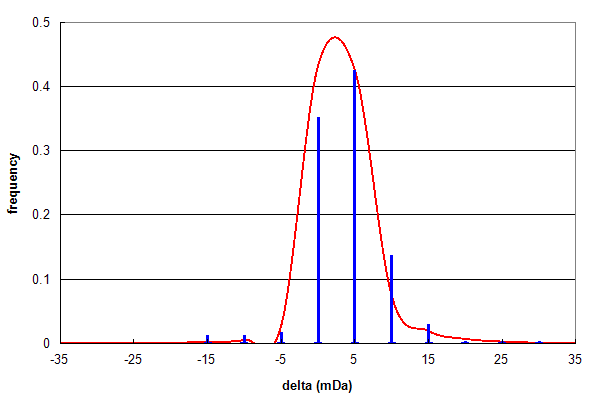 Figure 1, Data set #1. Parent ion mass accuracy frequency histogram (in milliDaltons) calculated for all best assignments (red line) and for peptides with at least one N or Q deamidation (blue bars). From Vialas V, et al., GPM11210027669.
Figure 1 shows the results of analysing a data set (#1) consisting of high quality, high resolution peptide mass spectra and
testing for peptide deamidation, using the same type of histogram described in Search engine basics 2, below.
Even though deamidated peptides only comprise 2.5% of the identifications, their δ frequency distribution follows the
same pattern as the overall identification distribution quite accurately, suggesting these assignments are mainly true positives.
The ratio of Asn:Gln deamidations in this data set is 253:47 (~5:1).
This assymetry can be easily explained by the known chemistry
of the deamidation reaction. In peptides, the main factors determining the rate of
the deamidation reaction are whether the residue is Asn (faster) or Gln (slower) and whether the residue C-terminal to the
reaction has a small (faster) or a bulky (slower) sidechain (N. E. Robinson).
In practice, Asn-Gly bonds have the fastest reaction rate, with a first order reaction half-life < 1 day. Asn:Gln ratios of
up to 10:1 are can be obtained when a sample has been analyzed promptly following protein digestion.
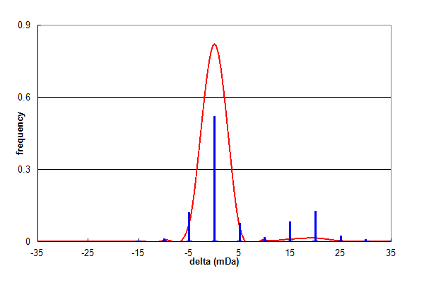 Figure 2, Data set #2. Parent ion mass accuracy frequency histogram (in milliDaltons) calculated for all best assignments (red line) and for peptides with at least one N or Q deamidation (blue bars). From Coute Y, et al., GPM64530003216.
Figure 2 shows the results of analysing a similar data set (#2), which shows the same overall trend as Figure 1. In this data set,
deamidation comprises 12.5% of all identifications and Asn:Gln is 2:1. However, there is a significant high mass satellite
on the deamidation distribution, centered approximately 20 mDa higher than the overall distribution. This additional
distribution is not caused by deamidation at all, but a common problem in peak finding associated with the 13C isotope
envelope of peptide ions (Schulz-Trieglaff). Any algorithm trying
to assign parent ion masses will occasionally choose the wrong peak in the isotope envelope, most frequently the 13C1 peak.
This peak has a mass that is one neutron heavier than the desired all 12C peak, resulting in a mass shift of +1.00335 Da. If
this occurs, it is possible to confuse this mass shift with that corresponding to deamidation, resulting in a mass
assignment error of 1.00335-0.98402 = +0.01933 Da. Therefore, this satellite peak is not the result of deamidation, but
the result of a parent ion mass assignment error.
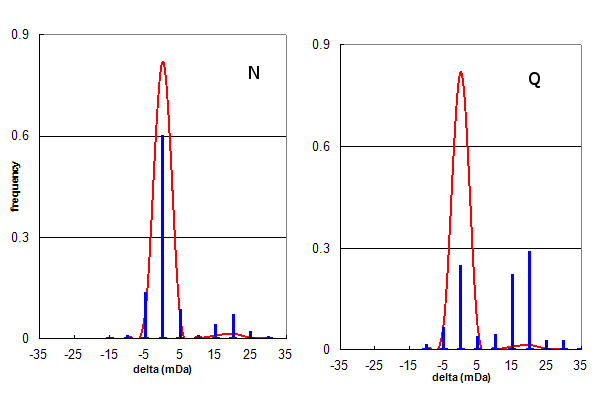 Figure 3, Data set #2. The same data as in Figure 2, plotted separately for only N (Asn) or only Q (Gln) deamidation.
Figure 3 further examines the deamidation identifications from data set #2, by creating separate histograms for
Asn and Gln deamidation assignments. Visual inspection shows that the Asn deamidation assignments are mainly correct, while the
Gln assignments are about 60% peak finding errors. Taking these numbers into account, it is straightforward to calculate a
corrected Asn:Gln deamidation ratio for data set #2 is ~6:1, similar to that obtained for data set #1.
It is important to note that while the assignments associated with the satellite distribution may be considered to be
false assignments, they are only false in that they have misassigned deamidation. The overall peptide and protein
sequence assigned to those spectra are most likely true assignments: they simply have a couple of the details wrong
for understandable reasons. Classifying this type of assignment error using the language of
statistical hypothesis testing should
be done with some caution (and humility).
Search engine basics 101 #2, by Ron Beavis (2014/08/17)
Using parent ion mass accuracy to evaluate subpopulations found in peptide MS/MS data.
When developing peptide identification algorithms one of the biggest problems is trying to evaluate
the effects of changing some feature of the algorithm or its input parameters. You want to maximize
the number of true positive identifications without adding false positives, but often it is difficult
to be sure that you have achieved that end. The target-decoy simulation method is commonly used to assist making
this type of decision. However, this single simulation can be difficult to interpret when a data set is composed of multiple
distributions. There is always the possibility that any incremental improvement obtained by tinkering with the algorithm
may be the result of exploting flaws in the simple interpretation of this simulation rather than generating more
genuine true positive assignments.
There are several methods that use physical and chemical properties calculated from
high resolution mass spectrometry measurements, which can shed some light on this problem. The simplest
of these methods — and often the most useful — is to examine the parent ion mass accuracy distribution
associated with peptide identification results. The parent ion mass accuracy (δ) can be defined as:
Equation 1. δ = M - m
where M is the neutral mass obtained from the measured parent ion m/z & z and
m is the peptide neutral mass calculated from the assigned peptide sequence. δ is commonly
expressed in either Daltons or parts-per-million (ppm).
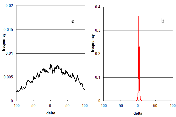 Figure 1. Parent ion mass accuracy frequency histograms calculated (in ppm) from peptide assignments to an LC/MS/MS experiment using HCD fragmentation. (a) False assignments only (using c- & x-ion peptide fragments); and (b) Distribution for normal assignments (b- & y-ion peptide fragments).
Figure 1 illustrates how parent ion mass accuracies are distributed under different analysis methods, using a real
set of 54,000 MS/MS spectra obtained from an LC/MS/MS experiment. Figure 1a is the
normalized frequency histogram of δ (in ppm) when the search engine is only allowed to test false solutions by forcing it to use the
wrong peptide fragmentation chemistry and
disabling its statistical filters. The best false solutions form a broad arc, centred at 0 ppm. Figure 1b is the
histogram that is generated when the search engine is allowed to test true solutions and the statistical filter settings
normally used when data is re-analyzed for inclusion into GPMDB. The best solutions in this case form a narrow distribution (σ = 2 ppm)
conforming to the resolution of the mass spectrometer used in the experiment.
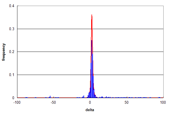 Figure 2. Parent ion mass accuracy frequency histograms (in ppm) for all best peptide assignments (red line) and only peptide assignments that predict a methonine sulfoxide (blue bars).
Figure 2 compares the overall distribution in red (same as Figure 1b) with a subpopulation of identifications that
correspond to peptides identified with
methionine sulfoxide modifications in blue (~ 1% of all ids).
Even though this
subpopulation is small, the two histograms overlap almost identically, strongly suggesting that the assignments of
modified peptides were largely true positives. Subtracting out the assignments that conform with
the red distribution, one is left with a low background spread over the entire range of δ values, amounting
to 14% of assignments. In a normal analysis most of these assignments that conform with the false assignment distribution
(Figure 1a) would be removed by selecting a narrower parent ion mass
threshold, e.g., ± 10 ppm, which would reduce the false positive rate estimated from Figure 2 to be
about 2% of the methonine sulfoxide containing peptides.
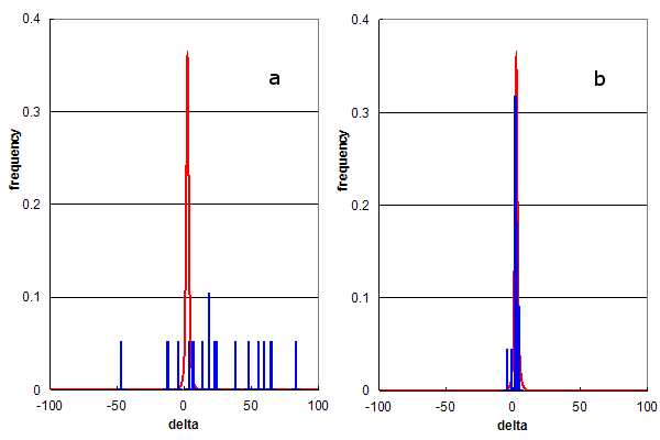 Figure 3. Parent ion mass accuracy frequency histograms (in ppm) for all best peptide assignments (red line) and only peptide assignments that predict specific modified residues (blue bars). (a) Residue modification = methionine sulfone; and (b) Residue modification = arginine dimethylation.
Figure 3 utilizes this type of analysis to determine the selectivity of rare modification assignments. Figure 3a shows the comparison of all identifications to those containing methionine sulfone (the addition of 2
oxygens) while Figure 3b compares identifications containing dimethyl-arginine.
Both of these modifications were assigned to about 30 identified peptides (0.065% of all ids), but there
behavior is clearly completely different. The methioine sulfone assignments are distributed like the false assignments in Figure 1a,
while the dimethyl-arginine assignments conform to the red distribution. An estimate of the false positive rate
for the assignment of methionine sulfone would be nearly 100%, i.e., there is no convincing evidence for methionine sulfone detection.
Figure 3b suggests that the false positive rate for dimethyl-arginine assignment is too
low to accurately calculate from this data, strongly supporting the hypothesis that peptides containing dimethyl-arginine were
detected by this experiment.
These examples demonstrate an important feature of all proteomics data analysis:
subpopulations created by independent hypotheses have independent error rates, which may be very different from the
overall population. These subpopulations can be generated in many ways: additional identifications generated by changes in an algorithm,
changing search engine parameters, or simply selecting out peptides that start with "P" or end with "F".
If you wish to rely on this subpopulation
to make decisions with consequences (such as spending money to follow up on an observation), it is important to
characterize these individual error rates as thoroughly as possible.
Search engine basics 101 #1, by Ron Beavis (2014/08/11)
An example of why simple ion counting is not commonly used as a score in proteomics search engines.
Recently, the idea has been put forward that simple "ion counting" can be used as a practical, reliable scoring system
for proteomics software tasked with identifying peptides based on tandem mass spectra
(Wenger CD, et al., and
Zhang B, et al.). The algorithm associated with this scoring system is simpler
than those employed by the existing search engines (e.g., Mascot, X! Tandem, OMSSA, etc.), making practical implementation
easier and the results more immediately comprehensible. An example of this type of algorithm is as follows:
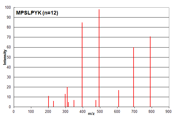 Spectrum 1. Assigned to the peptide sequence MPSLPSYK, with an ion count n = 12. Matched peaks shown in red.
Spectrum 1 shows an example where ion counting works exactly as expected. The identified peptide shows very good
correspondence with the spectrum and most investigators would consider this assignment to be of high confidence. It is important to note that
the ion count n does not take into account the relative intensity of peaks: all peaks are simply counted as
+1 if they are in the list of measured peaks. However, in this case, all of the peaks are identified, so the intensity of
each peak is not an issue for the analyst.
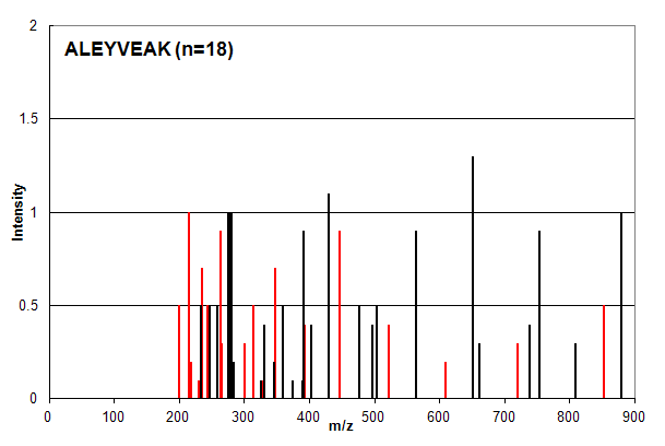 Spectrum 2. Assigned to the peptide sequence ALEYVEAK, with an ion count n = 18. Matched peaks shown in red, unmatched in black.
Spectrum 2 is an example of a common case in which ion counting provides an over-confident estimation of a peptide
identification. The intensity profile of the assigned peaks (red) is very similar to the unassigned peaks (black) and
most investigators would place little confidence in this type of identification. The ion count scoring system, however,
assigns signficantly greater confidence to this identification compared to that in Spectrum 1 (n = 18 vs. n = 12).
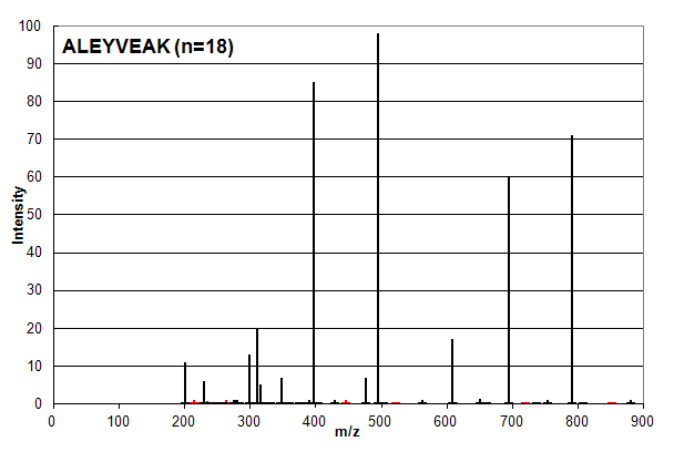 Spectrum 3. Assigned to the peptide sequence ALEYVEAK, with an ion count n = 18. Matched peaks shown in red, unmatched in black.
Spectrum 3 is the union of Spectrum 1 and 2, that is all of the peaks in Spectrum 1 and 2 are present on the same scale. Based
on ion counting, the assigned peptide sequence is ALEYVEAK and the assigned peaks are shown in red (not all of the red peaks are visible at
this scale). Anyone skilled in proteomics data analysis would say that this assignment order is wrong:
the sequence MPSLPSYK (n = 12)
should be assigned as it is in Spectrum 1 and the sequence ALEYVEAK (n = 18) should be strongly discounted or ignored.
Much of the perceived complexity
associated with search engine algorithms that use ion counting as part of their scoring systems, such as Mascot or X! Tandem,
is involved in trying to use peak intensities and other factors to avoid this type of pathological sequence assignment behavior.
Copyright © 2014, The Global Proteome Machine Organization.
Privacy Statement
|